
Stakeholder
Year
Role
Actions
:
:
:
:
Marketing Division, Andalin
2021
UI/UX Designer
Research, Anaysis, Information Architecture, UX Design, UI Design, Project Management, User Testing
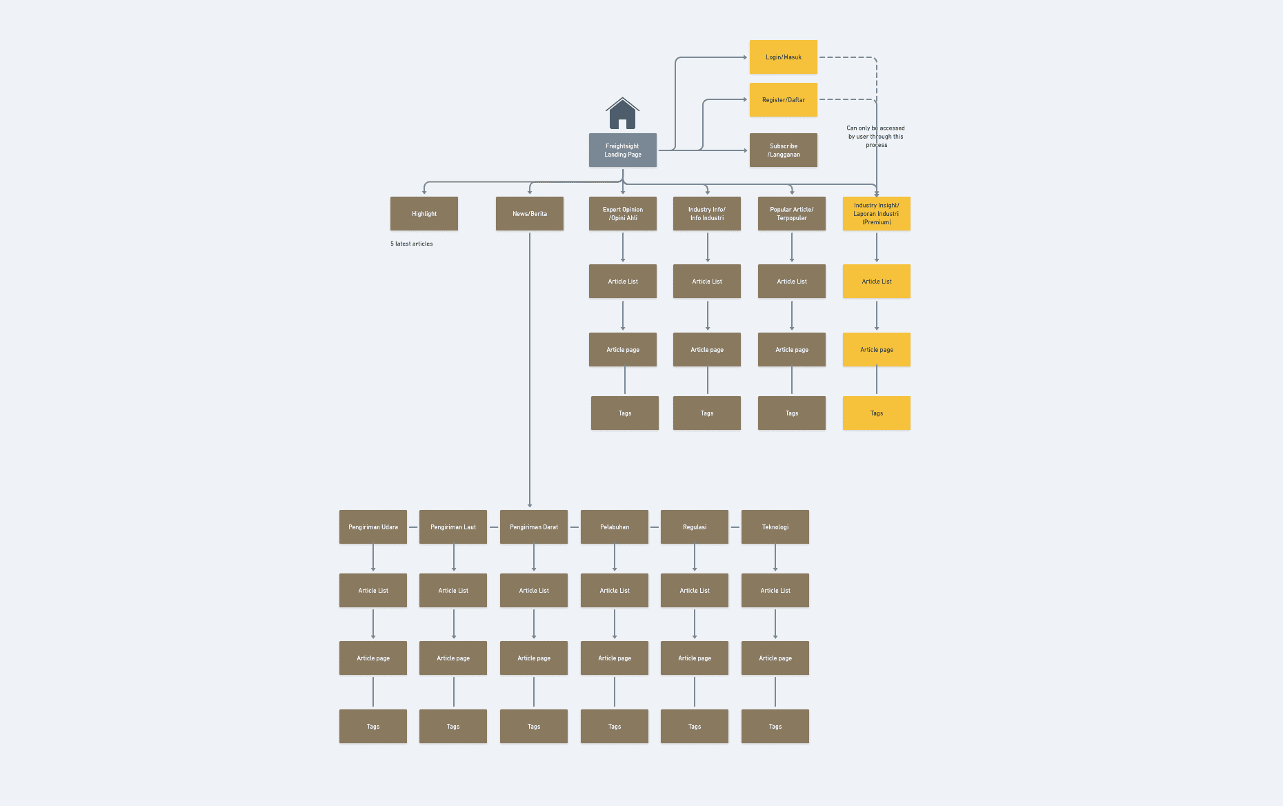
Freightpair revamping has the main goal to transform the current website freightpair.com to a news portal where visitors or users will be able to see the latest news and update about freight forwarding industries in Indonesia. In the meantime, users will also be able to obtain information about latest shipment rates as well.
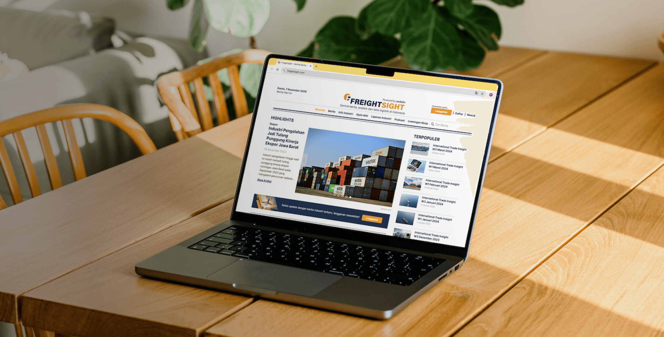
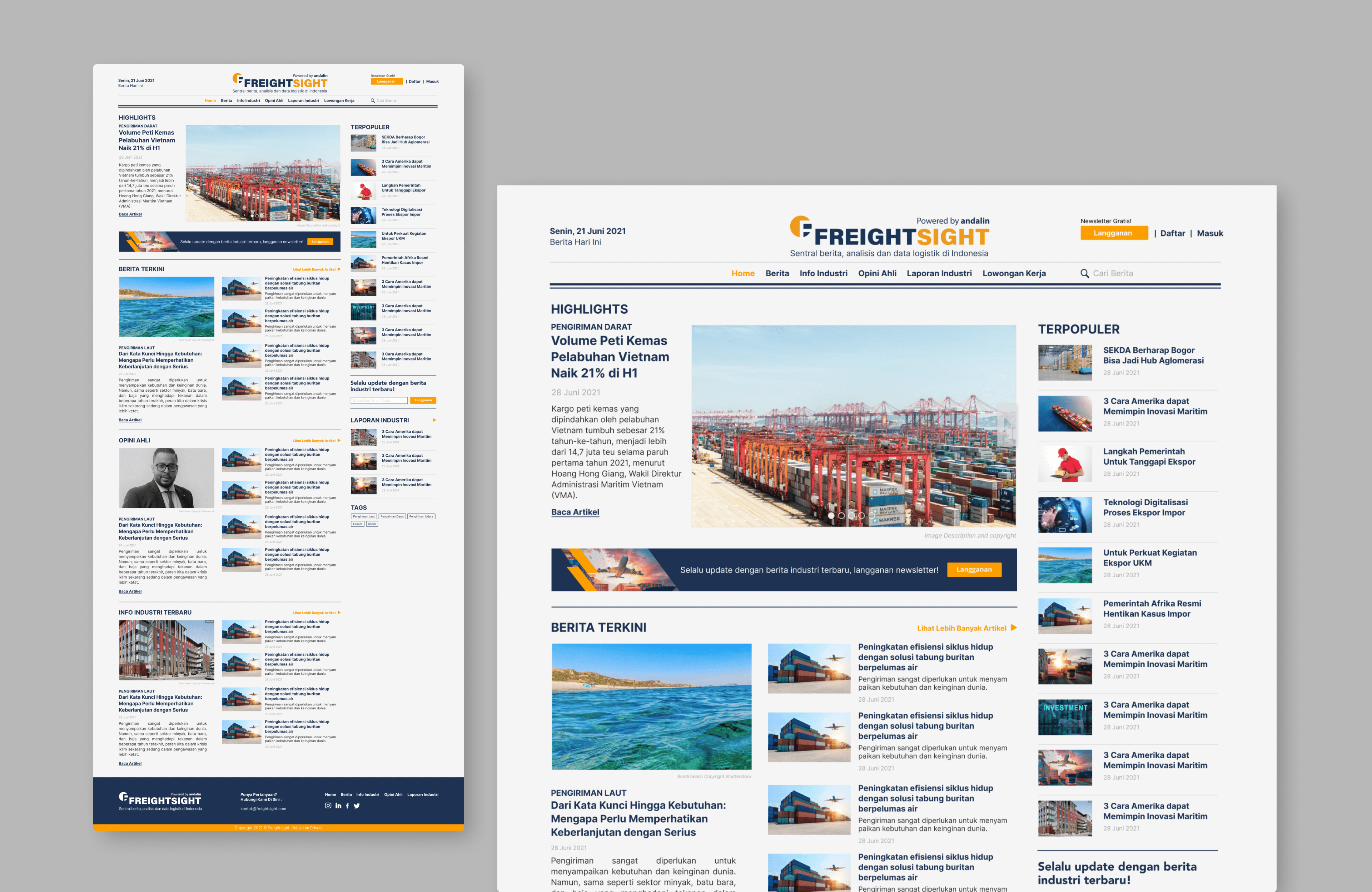
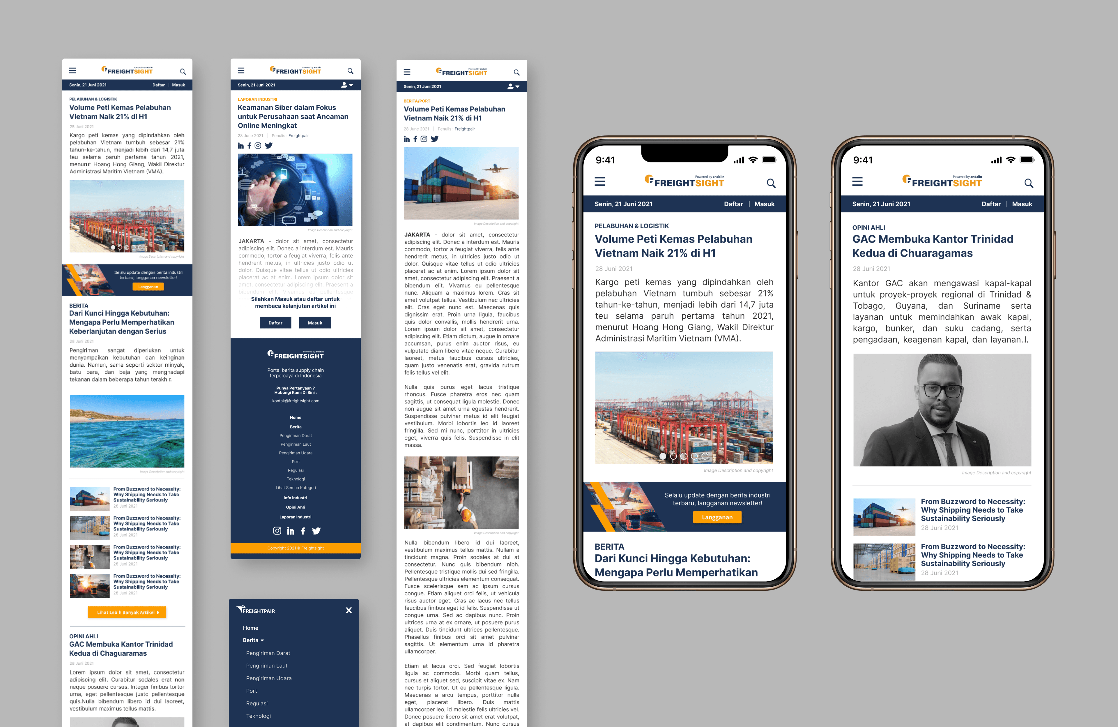
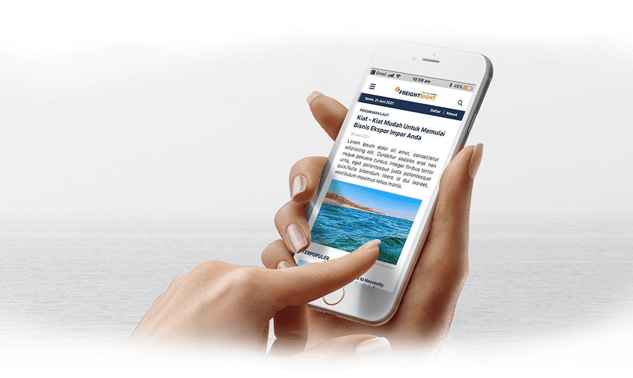
The name of the platform later changed to "Freightsight" to match the website vision and mission. The goal will be translated through Freightsight website (freightsight.com) as a news portal where customers could find the latest information related to export import commodities and business trend in Indonesia and global.
Freightsight to be the no.1 media portal for supply chain in Indonesia
Be a relevant and resourceful news portal for Indonesia freight forwarder industry
Give additional value to customers through news and rate index information
Become a channel to build brand awareness, activation and retention
Sea Trade Maritime News
Strength
Has been known globally as one of the fastest growing global maritime news site for a quite long time.
Market leader in connecting the global maritime community that has a diverse portfolio of publications,
events and business intelligence resources.
Connection to ocean trade expert enable them to provide up to date and reliable article insight, increasing people trust to the news portal.
Weakness
There are too many advertisement throughout the website which can distract the visitor focus. It is also makes the visitor feels uncomfortable when strolling throughout the website.
The website layout might seems out to date for some people
Messy information layout arrangement in both desktop and mobile version
Opportunity
Design a news portal without advertisments. Advertisement that comes from internal Freightsight will be show as a pop up which will be layouted properly so it will not annoyed visitor.
Better information layout arrangement
Better design to enhance the reader comfort when reading article or strolling the website
Create a better mobile browser view
Threats
Sites like Sea Trade Maritime and many other websites available on the internet
Journal of Commerce (JOC)
Strength
Provide a wide range of important news categories in logistics
Following the latest trend of media information by having a Podcast
Weakness
Probably lack of SEO, the search engine only show 1 correct website recomendation about JOC, the rest are the other thing that not related to JOC
Too many information within one page
Font size might too small for some people
Opportunity
The first news portal for freight forwarder in Indonesia (using bahasa)
Better information layout arrangement and selection
Use big enough font that will be comfortable for young and senior visitor
Threats
Sites like JOC and many other websites available on the internet
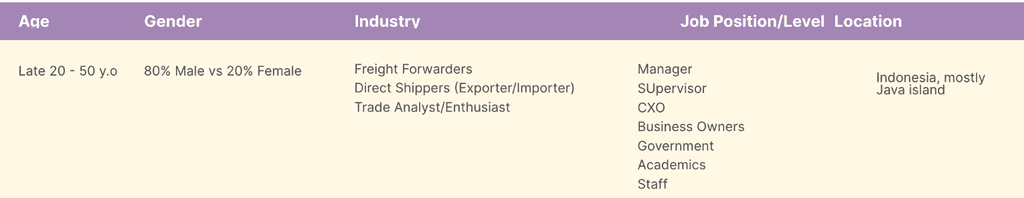
1.1 User Demographic
1.2 User Personas


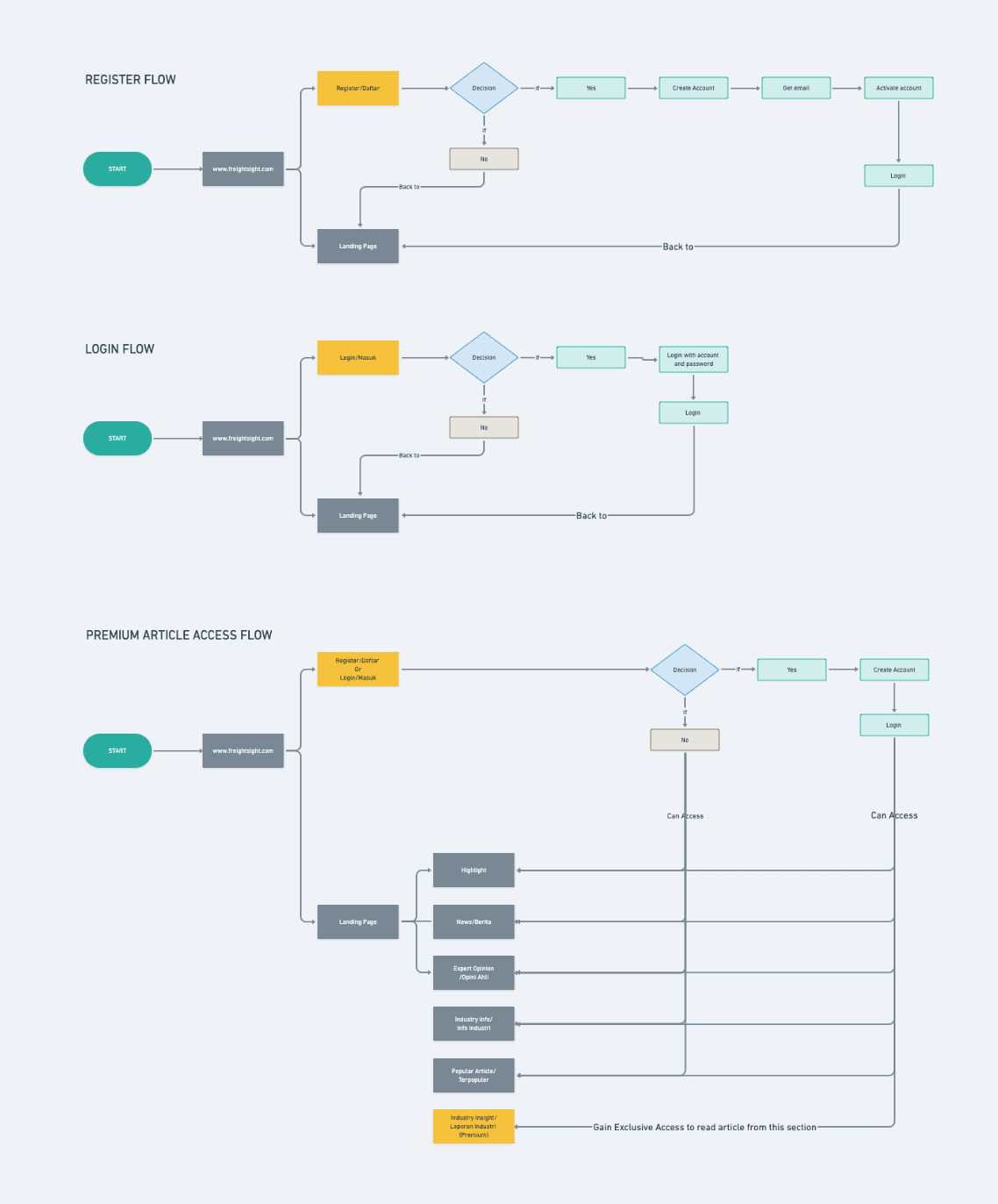
1.3 Minimum Viable Product (MVP)
MVP Need #1: When using this website, I don’t want to overwhelm by too many information. I need to read comfortably.
Feature Requirement: Clean, easy to read layout. (prefer to personas favorite news portal something between The New York Times and JOC)
MVP Need #2: When using this website, I want to read summary of the article first because it help me to decide wether the article is relevant with my interest and need.
Feature Requirement: 2- 3 lines paragraph of excerpt in each articles.
MVP Need #3: When using this website, I want to be able to share my favourite article to my colleagues so they can also know the latest information related to our company business.
Feature Requirement: Share button link to social media : Linkedin, Whatsapp, Facebook, Twitter
MVP Need #4: When looking for a business tips regarding export import shipping, I want to find a reliable source that can enrich my knowledge to help me make a better decission for my business.
Feature Requirement: Specific article and article section that contain valuable and reliable insight about export import. Such as Industry Insight or expert opinion.
MVP Need #5: When using this Website, I want to keep updated with the latest article published.
Feature Requirement: Subscription
MVP Need #5: When using this Website, I want to read and understand the content clearly, which I prefer the article use my native language.
Feature Requirement: As the target market of Freightsight is Indonesian, the website should be all using bahasa.
Wireframing
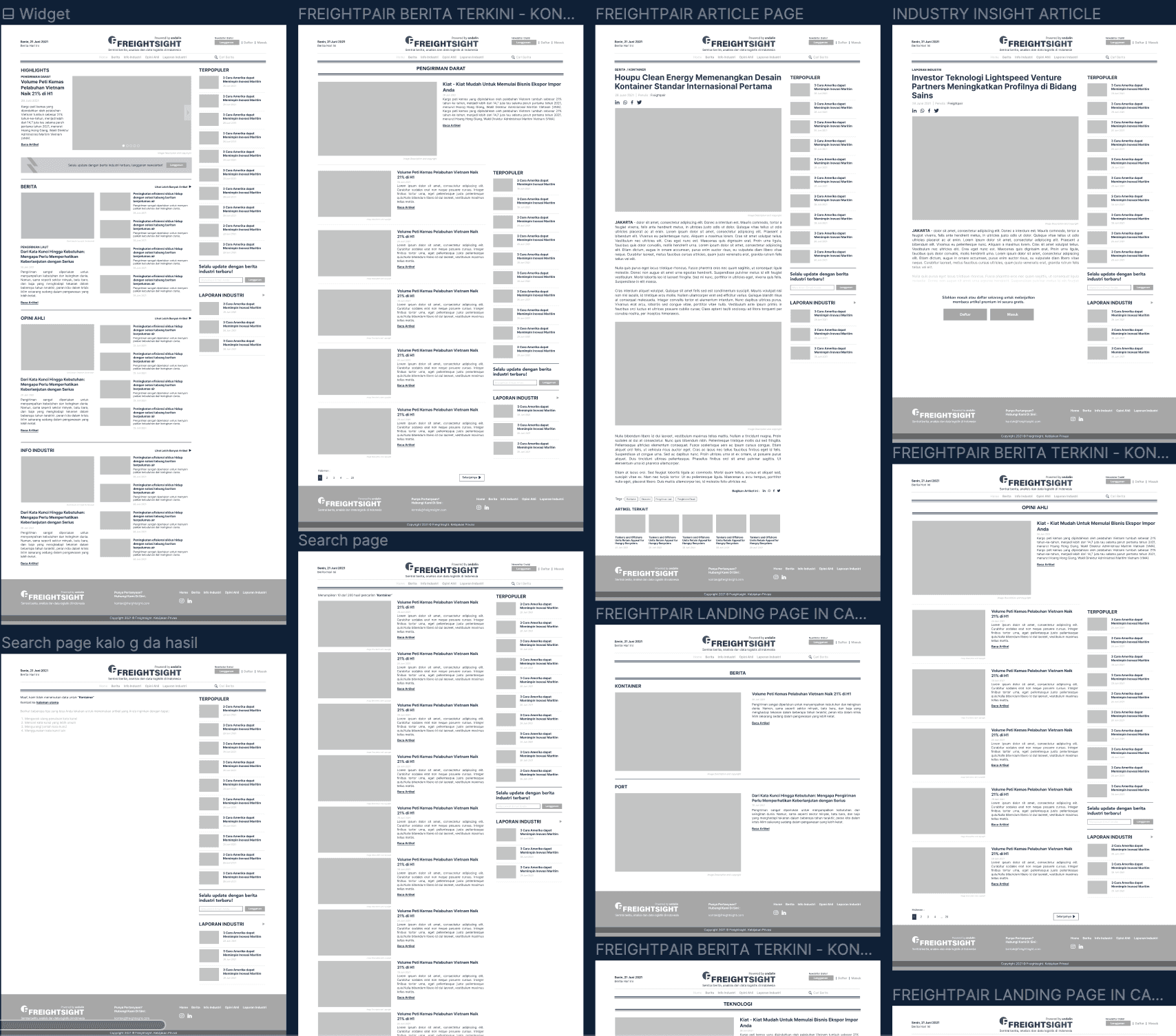

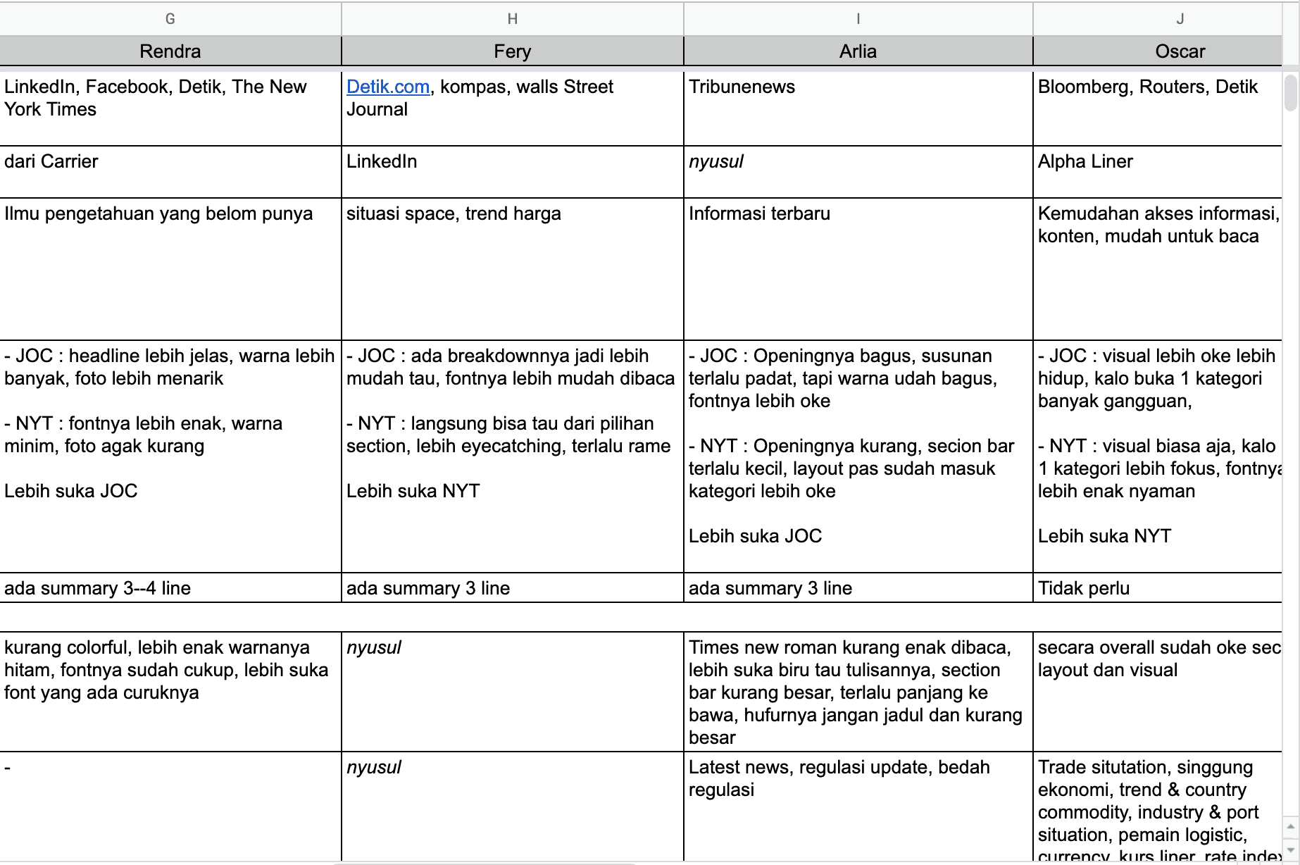
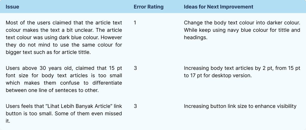
First, I found that most of the respondents are comfortable reading from news portals with a simple layout, such as The New York Times and Detik. However, while they noted that Detik has too many ads, which can be distracting, they still find it enjoyable to read due to its simple navigation. So, I decided to implement the simple and clean theme to Freightsight.com to promote easy navigation. I also made it a priority to minimize unnecessary distractions, such as advertisement banners, and to eliminate clickbait ads.
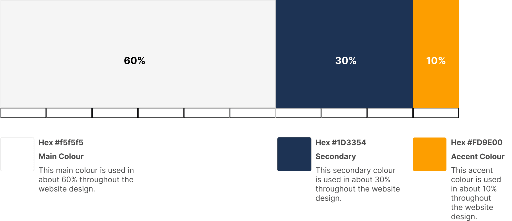
Second, in terms of color, I also consider to use #f5f5f5 white with hint of light grey instead pure white #fffff for the background and Dark Blue #1D3354 for the text. There were reasons for this decision. The Dark Blue color, I took it from the Freightsight color identity. I avoid to use pure black #00000 for the text and pure white #fffff for background, as the recent research on readability found that using pure black on top of pure white background can cause eye strain to the reader when user read the text over an extend period.
Although the real problem is not always because of the black as text color. Black color in fact can be good for small thin fonts such as body text. A background that is too bright such as #fffff pure white can also be a major contributor to digital eye restrain since its too bright. Pure white has 100% of color brightness while pure black has 0% color brightness. Thus disparity in color brightness creates intense contrast light levels that can overstimulate the eyes when reading text.
A research study on Reading and Myopia found that black text on white background overstimulates the OFF ganglion cells white white text on black backgroudn overstimulates the ON ganglion cells which means white text from a black screen could inhibit myopia while black text on white background may stimulate myopia. The study advises against reading text on white background due to the significant contrast polarity.
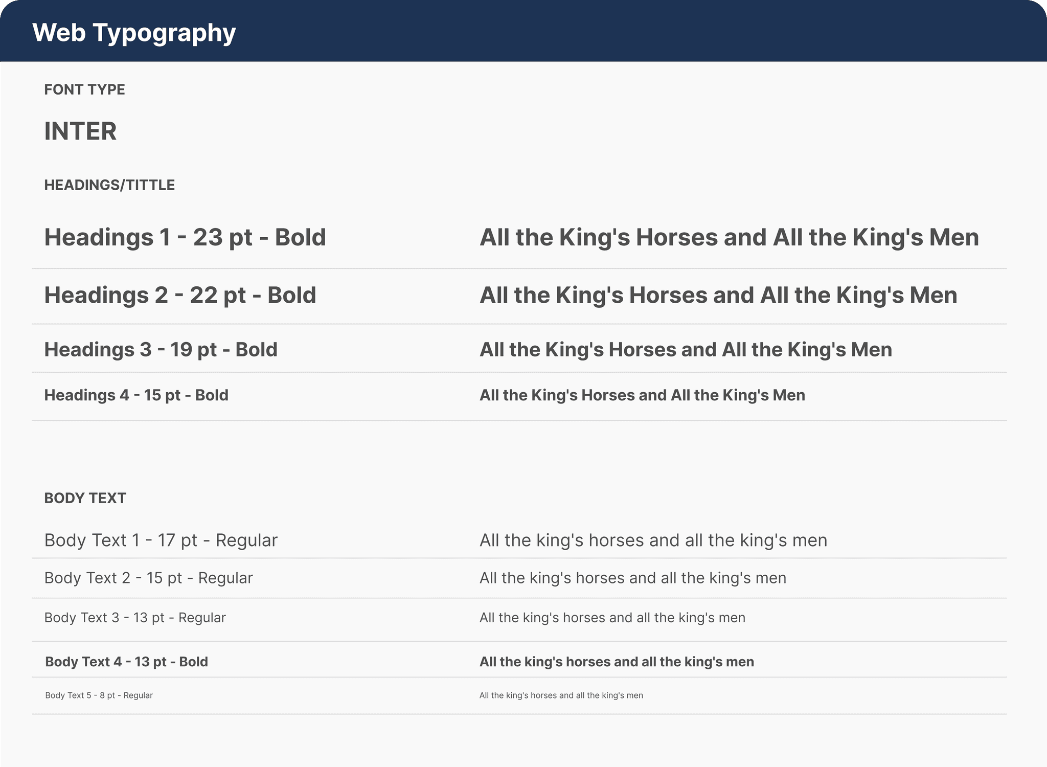
Typography
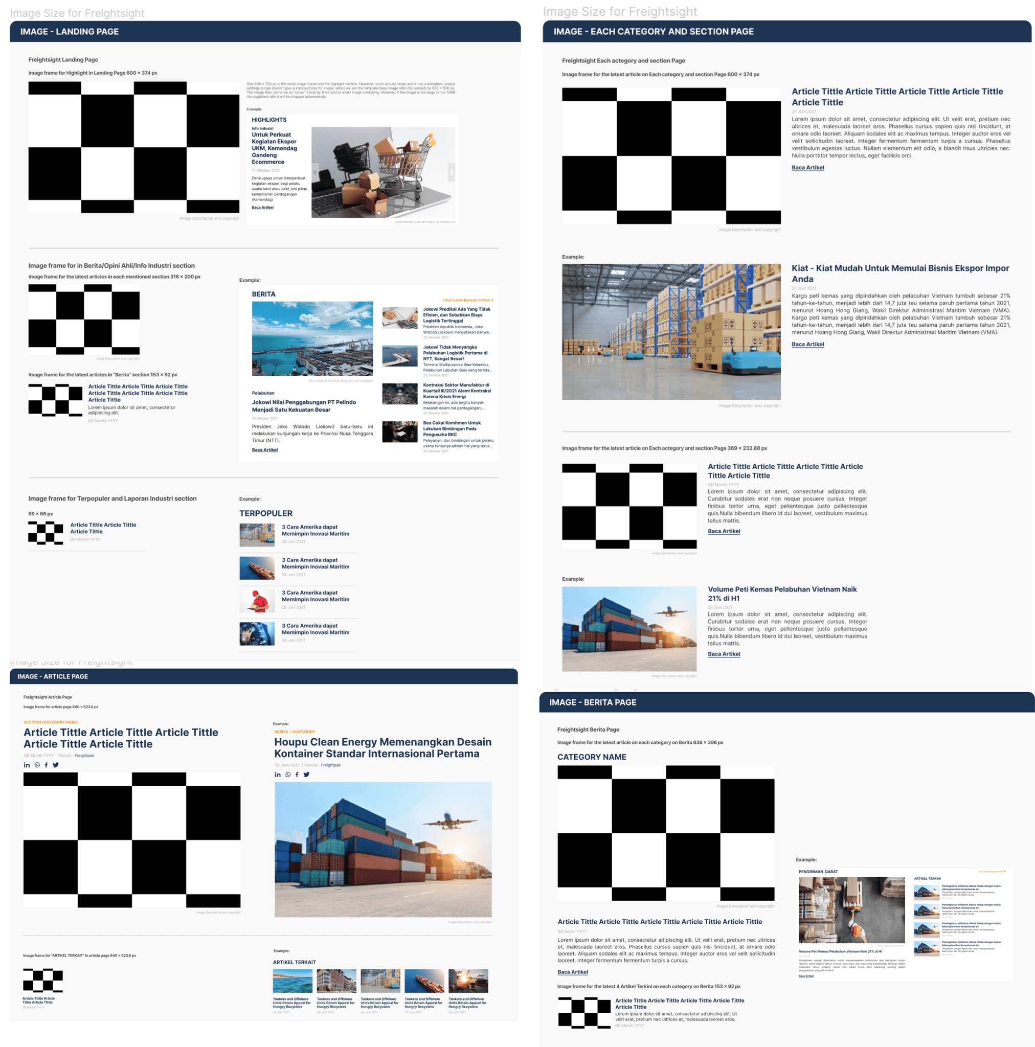
The website has several image size configuration. I created the image size guidance to ensure the image size frame for each website section consistent.
©Julianaputri. UI/UX Designer Portfolio. 2024